
loganswartz/sunburn.nvim
 github
 11
11
 1
1
 1
1
 1
1
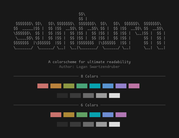
sunburn.nvim
A Neovim colorscheme emphasizing readability above all else.
Usage
This colorscheme uses my own experimental Neovim colorscheme framework, polychrome.nvim, so you'll need to install that in addition to this plugin.
Using lazy.nvim:
{
    'loganswartz/sunburn.nvim',
    dependencies = { 'loganswartz/polychrome.nvim' },
    -- you could do this, or use the standard vimscript `colorscheme sunburn`
    config = function()
        vim.cmd.colorscheme 'sunburn'
    end,
}
Using Vim-Plug:
Plug 'loganswartz/polychrome.nvim'
Plug 'loganswartz/sunburn.nvim'
Then, somewhere in your vimrc:
colorscheme sunburn
About
A lot of colorschemes use palettes that have very different perceptual brightness levels, leading to certain colors being harder to read and others being almost glaring to the eye. The main goals I had in mind when designing this colorscheme were that the colors should all have these properties:
- The same perceptual brightness (no one color should "jump out" more)
- A distinct and unique hue (ie. can't be easily confused with each other)
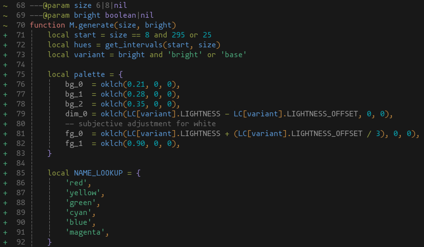
To accomplish this, I used the Oklab colorspace, which is a fairly new colorspace that is meant to map values to human perception as closely as possible. That made it very easy to formulate a palette that has the same perceptual brightness and doesn't change hues when being brightened.
The colorscheme more or less emerged on its own from the combination of these restrictions. Technically, the colorscheme is currently formulated using Oklch, which is a transformation of the Oklab colorspace, and I used oklch.com to find and tweak the values.
Due to how human vision works, the perception of a hue at a certain brightness may be representable on a typical computer screen via sRGB, but a different hue at the same brightness will be completely outside the sRGB space. This means that the value has to be clipped to the closest sRGB value, which then doesn't look like the same hue and/or brightness.
The palette was chosen in 2 steps:
- finding a chroma value and a range of acceptable lightness values
- finding hue values for each of the needed colors.
The goal of finding a set of lightness and chroma values was to find values that would provide colors inside the sRGB gamut, no matter what hue was chosen, with an upper and lower range of lightness values. By doing this, I could define the normal colors using the lower bound lightness value, and then define the bright versions of those colors using the upper bound lightness value.
Oklab has strong hue uniformity, so to pick hues, I should ideally be able to find colors that are the most relatively distint by picking equidistant hue values. Doing this means that all other values will arise from my starting value, and any starting value should produce a set of values that are perceptually distinct. That being said, if possible, I wanted to pick a starting value that gave me hues closest to what we typically think of as "the main colors".
To do that, I picked a starting hue which, to my eye, was a "main color" and also encompassed the "smallest relative portion" of the hue range (ie. appears to take up the least space on the hue band). This appeared to be violet, so I settled on a starting value of violet = 295, based on nothing but my subjective taste. I need 8 total colors, so 360 / 8 = 45, meaning the final chosen hues should match this formula:
h = (45n + 295) % 360
Where h is the final hue value, and 0 <= n <= 7.
Misc
If you are using this and the colors don't look correct, make sure your terminal supports truecolor and the colors aren't being mangled by tmux or any other intermediaries, as that will throw off all the values.
Lualine
If you use Lualine, it should automatically pick up the theme when you activate it.